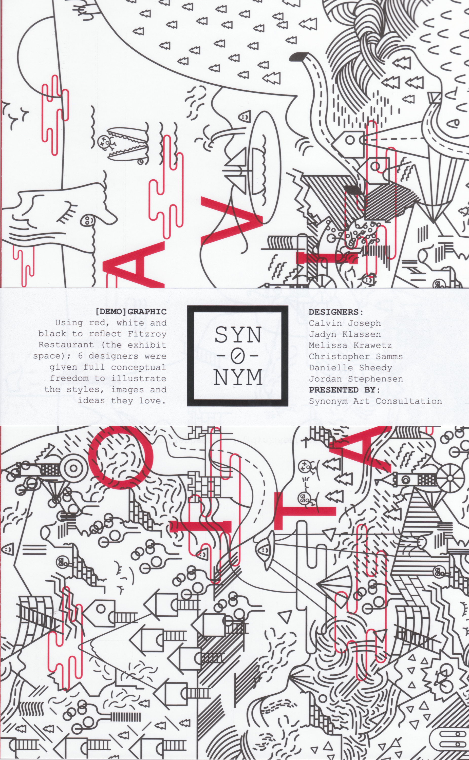
Founded in Winnipeg, Synonym Art Consultation aims to make art more accessible to the general public. Their latest attempt is an exhibition entitled [Demo]Graphic, installed at Fitzroy, a new Winnipeg restaurant located at 102 Sherbrook Street. Centred on a colour scheme of red, white, and black to represent the restaurant, all other aspects of the pieces were left to the discretion of the artists. This resulted in not only a huge range between the work of the different artists, but within the work of the individual artists as well.
Jadyn Klassen was inspired by the idea of problem-solving for his art. One of his pieces, “Navigation,” focuses on a mask, representing the start of a problem, specifically in graphic design. This is signified by “lorem ipsum” scrawled across the foreground, which is used as filler for text during the early stages of a project. Klassen’s other piece, “Problems,” acts as a commentary on graphic design, in which one navigates through their work via trial and error.
Christopher Samms, on the other hand, began his pieces by thinking about graphic design from a fine art perspective, ending in a territory between the two – he adds, “an area where graphic design and art seem to intersect.” Wanting to focus on the behind-the-scenes portion of graphic design, Samms constructed his pieces, “Nodes” and “Spread,” around the graphs, vectors, and lines that act as a backbone to the final product, making the ordinarily private beauty of graphic design open to the public.
In contrast to Samms, Calvin Joseph made fluidity the focus of his pieces “World Spin” and “This Love of Ours,” both of which are primarily composed of organic geometric shapes interacting with each other in the background. Joseph wanted to capture the fluidity of the wind when sailing using organic shapes, a theme in both pieces of his art.
Jordan Stephensen worked with fluidity in his pieces as well, but focused more on combining the typography aspect of graphic design with an illustrative style. Resulting in his two works, “Serif” and “Sans Serif,” Stephensen explored the relationship between serif and sans serif font. He plays with these categories through text, colour, and form in his pair of pieces, which are primarily based off a study of the ampersand and its variations.
Melissa Krawetz also opted to compose her pieces as a clear pair for the show, depicting order and chaos through minimalism and contrast. Her pieces, “Order” and “Chaos,” focus on the opposite aspects of order and chaos, both in form and colour.
Danielle Sheedy wanted to illustrate contrasting principles in her pieces for Fitzroy as well. “A Place For Everything” and “Everything In It’s Place,” looks at the juxtaposition between urban and rural life, primarily using colour as a means to express contrasting elements between the two pieces of art, as well as exploring the use of negative space.
By bringing together unrepresented artists with like-minded business owners, Synonym Art Consultation makes art more accessible – both for the patrons and the artists looking to share their work.
[Demo]Graphic will be on display at Fitzroy for approximately four months and in accordance with their mandate to make art more accessible, a postcard book of all the art in the exhibit is available through synonym.artconsultation@gmail.com for $25.